Zenfolio’s PRICING PLANS page REDESIGN
OVERVIEW
Although our original pricing plans page received a lot of traffic, it didn't result in many engagements. Additionally, the existing design was out of date, complicated to understand, and inconsistent with our brand guidelines.
PROJECT GOALS
Educate visitors on the benefits of our plans and our ability to help them achieve their goals, while gathering insight on the features they value most.
Increase engagement with our Call-to-Actions.
Revamp the page to align with our latest brand guidelines, present information in a clear and modern look and feel, and deliver a better user experience.
DATE
September 2018
MY ROLE
Lead visual designer
TEAM
Director of growth and acquisition
Product marketing managers
Web developer
Product manager
DELIVERABLES
New pricing plan page, new set of icons
Meet the Users
Zenfolio users are photographers of diverse genres. They can be freelancers, part-time photographers, and small business owners. Each type of user requires specific features to meet their portfolio and/or business needs. To provide suitable recommendations for their pricing plan, it's important to understand the unique requirements of our users and their photography goals.
Research
We wanted to focus on what features our customers really need to help them find the best plan that suits their needs. As a result, we opted to provide them with the flexibility to choose what's best for their business.
To determine the most advantageous features for photographers to grow their businesses, I conducted both qualitative and quantitative research.
Wireframes
I created the initial wireframes with the list of top 12 features with a lo-fi prototype in preparation for the preliminary testings. We called this the ‘recommendation engine’ with simple layout and fun design of different options. The recommended plan would be matched accordingly with the chosen options.
Testings
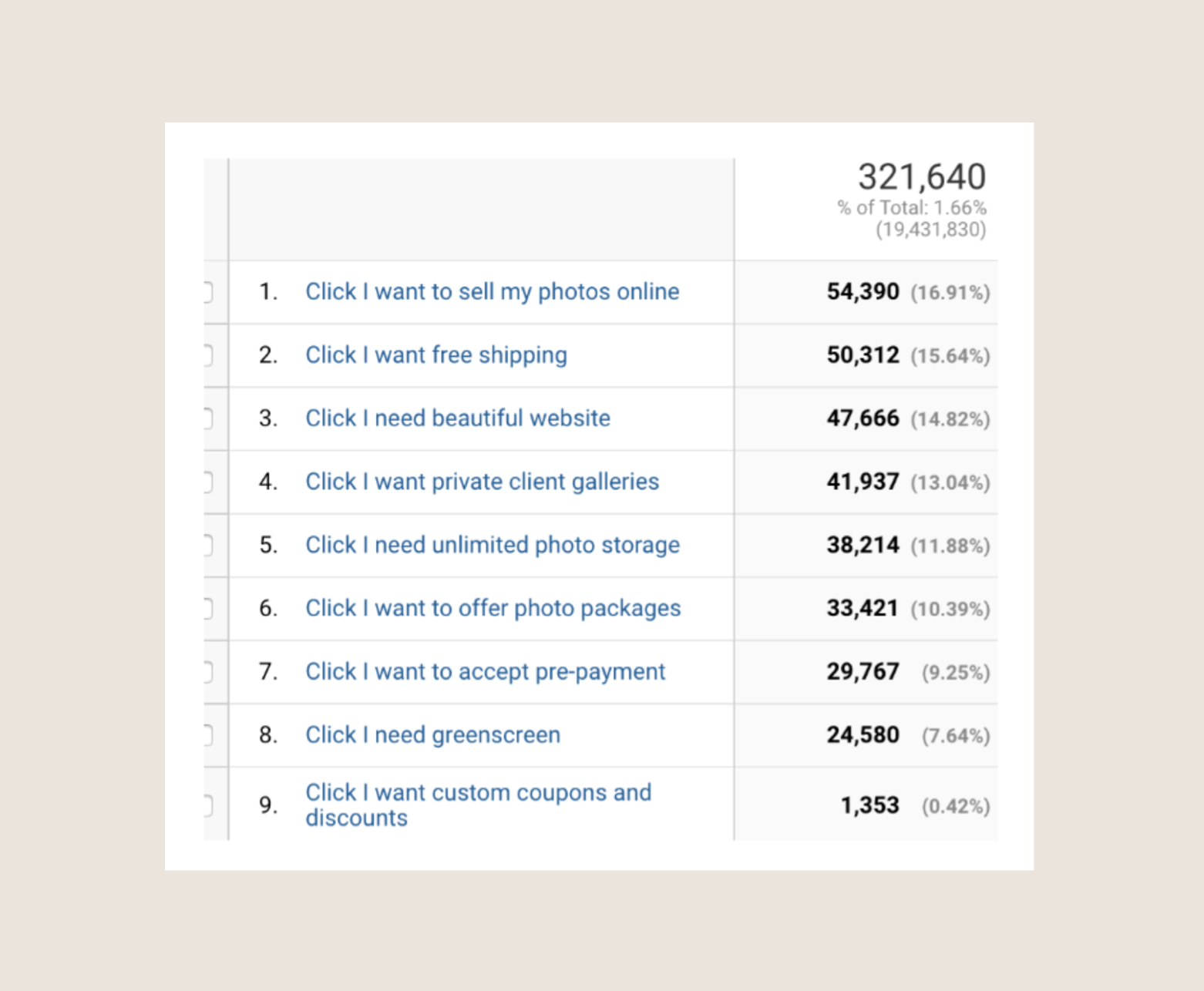
In order to decide if users engaged with the feature buttons, and if users really need all the features, we executed different testings with the variations of number of the buttons: 12 buttons vs 8 buttons, and 8 buttons vs 6 buttons. We eliminated the buttons based on the engagement rates. This was tested with the old pricing plans page, only with the new ‘recommendation engine’ section added. The version with 8 buttons was the overall winner!
After deciding on the features, we continued the testings with the redesign of the pricing plans, and the button styles (square vs. pill-shaped, lighter vs. bolder, old icons vs. new icons, etc.). The results were fascinating. We didn’t only have significant more sales, but also learnt a lot for the design improvements.
Button test results
Results
We saw an increase overall in all metrics for both Desktop & Mobile. The plans purchased increased significantly with the new design.
DESKTOP RESULTS
Direct to Paid STARTER
+25.43%
Direct to Paid PRO
+28.11%
Direct to Paid ADVANCED
+6.73%
MOBILE RESULTS
Direct to Paid STARTER
+80.01%
Direct to Paid PRO
+25.10%
Direct to Paid ADVANCED
+1.37%
Final Designs
Zenfolio’s Homepage Makeover
In addition to the testings with our Pricing plans page redesign, I also worked on a revamp of Zenfolio’s homepage. It was being tested after we had completed with the testings of the new Pricing plans page.
Our homepage is among the top pages that attract the most traffic. However, the layout and basic design style of the page have been out of date and unchanged for years despite many testings done.
I took the initiative to start and execute the plan for a total makeover for our Homepage. The goal was to clean it up, make it modern, professional, aesthetic and easy to use, and to show more of the product values that were proven by our in-real-life customers.
We saw a significant increase in the engagements and conversions rates. After 3 weeks of A/B testing the new design variation resulted in +51.23% Direct to Paid/ +34.42% Trial to paid/ +5.15% Visit to trial over the control.


